
Flourish
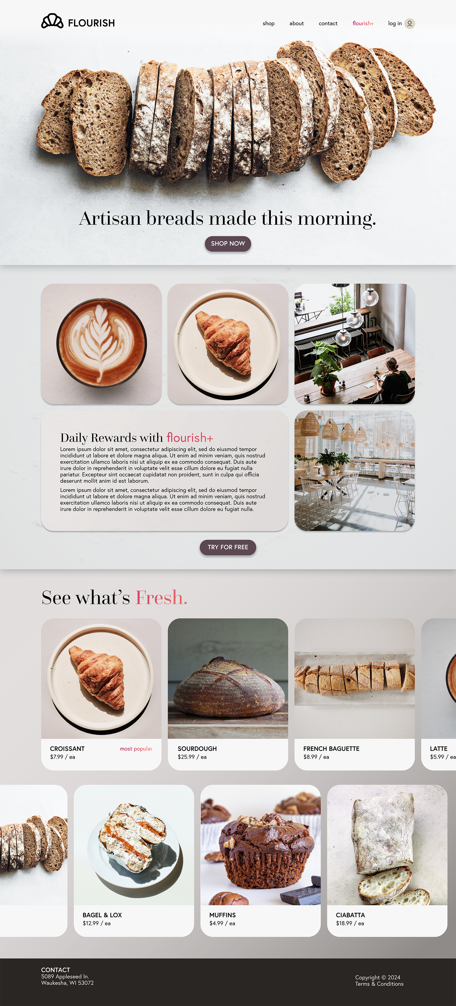
Flourish is an imaginary bakery created and branded by myself. This mock up of their website aims to show their warm café interior and invite visitors to try their subscription service which offers daily benefits for regular visitors. Flourish makes fresh confectionery every day and happily invites customers looking for a place to be productive, collaborative, and caffeinated.
Made using:
• Figma
• Photoshop
Color Harmony x Harmonic Analysis
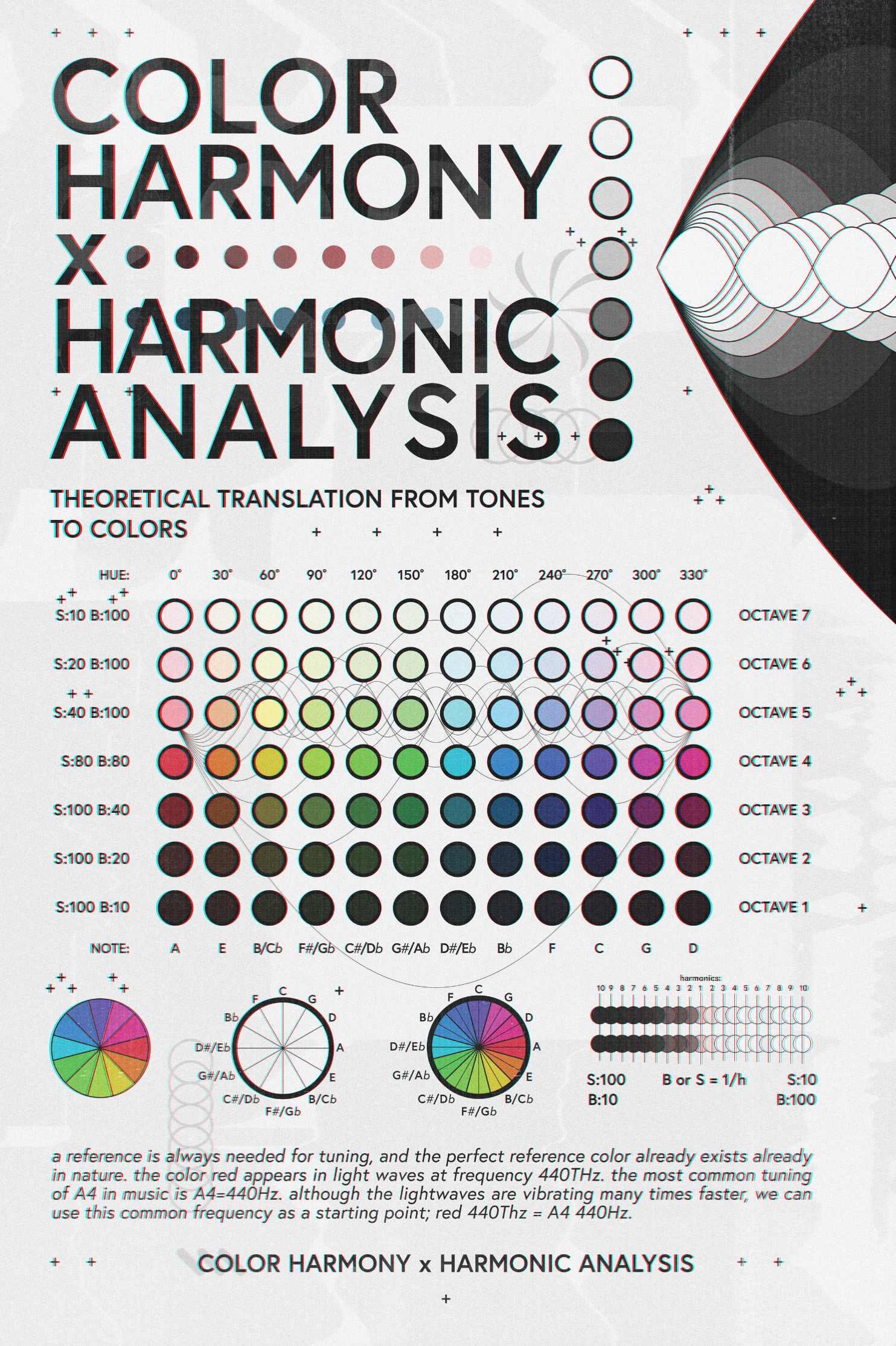
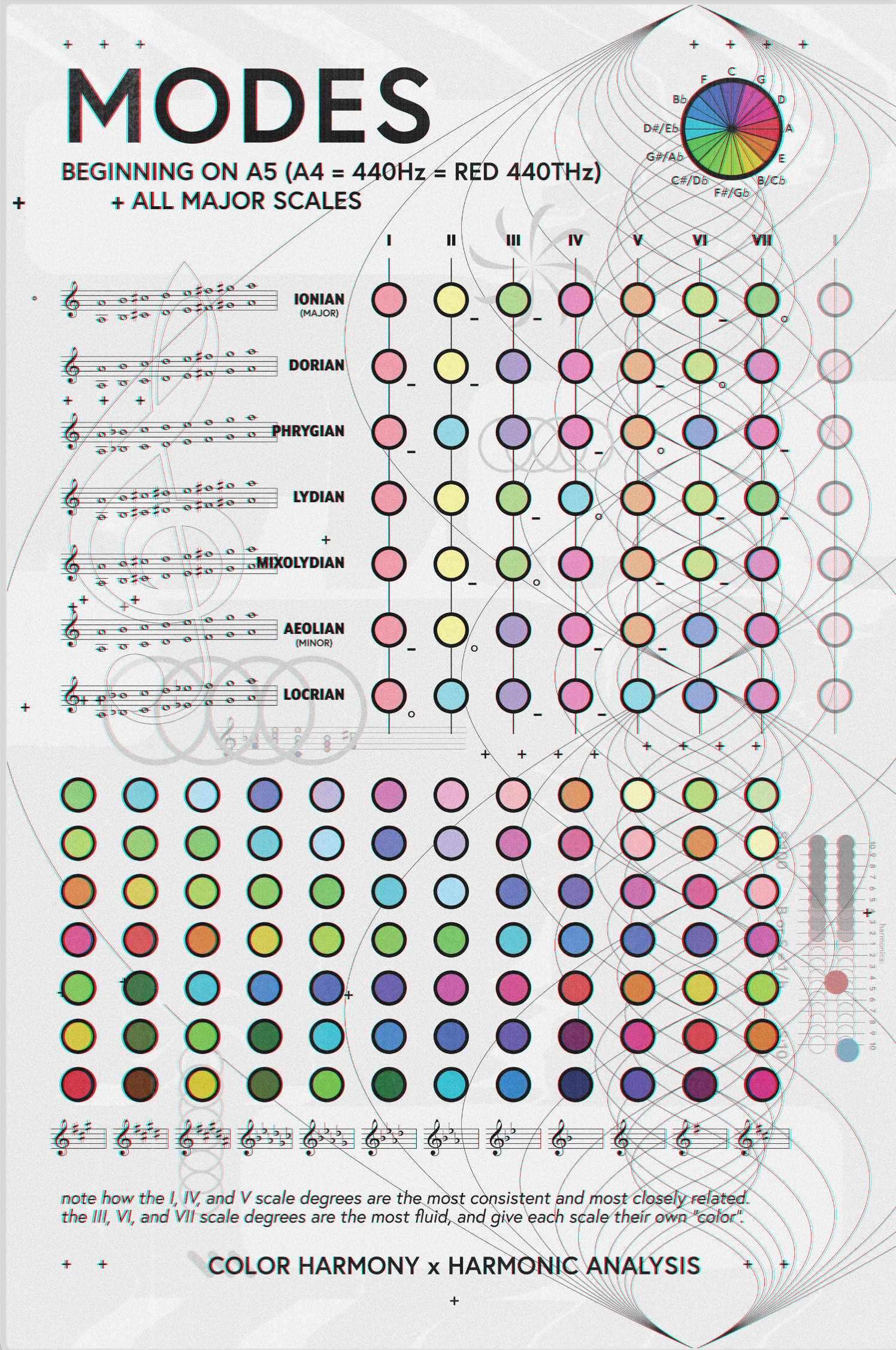
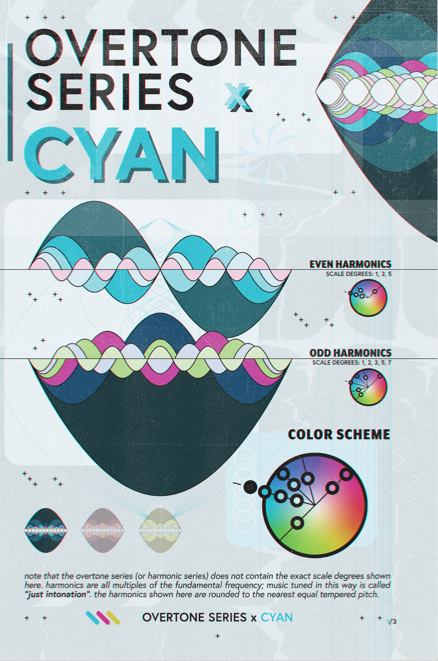
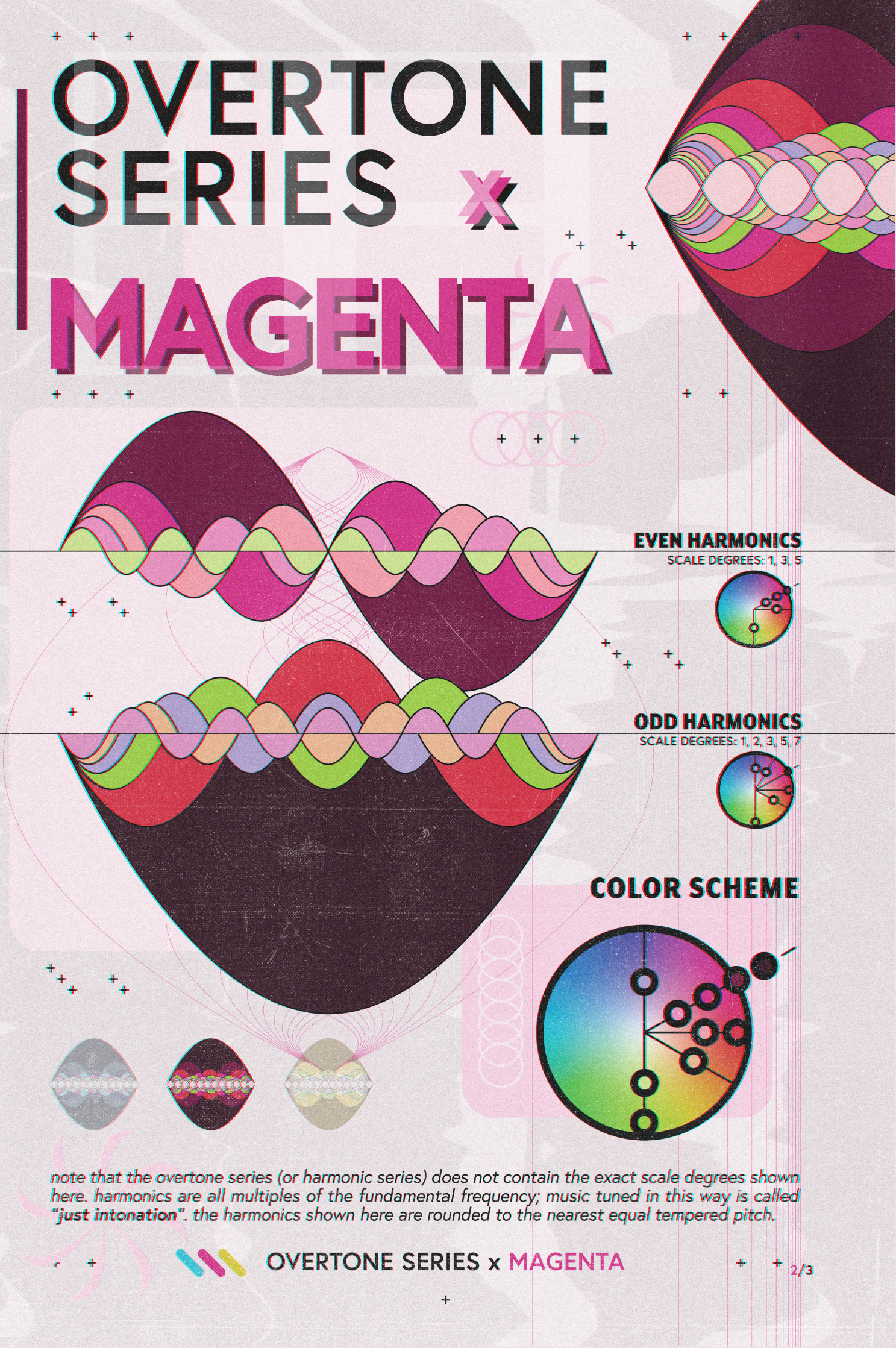
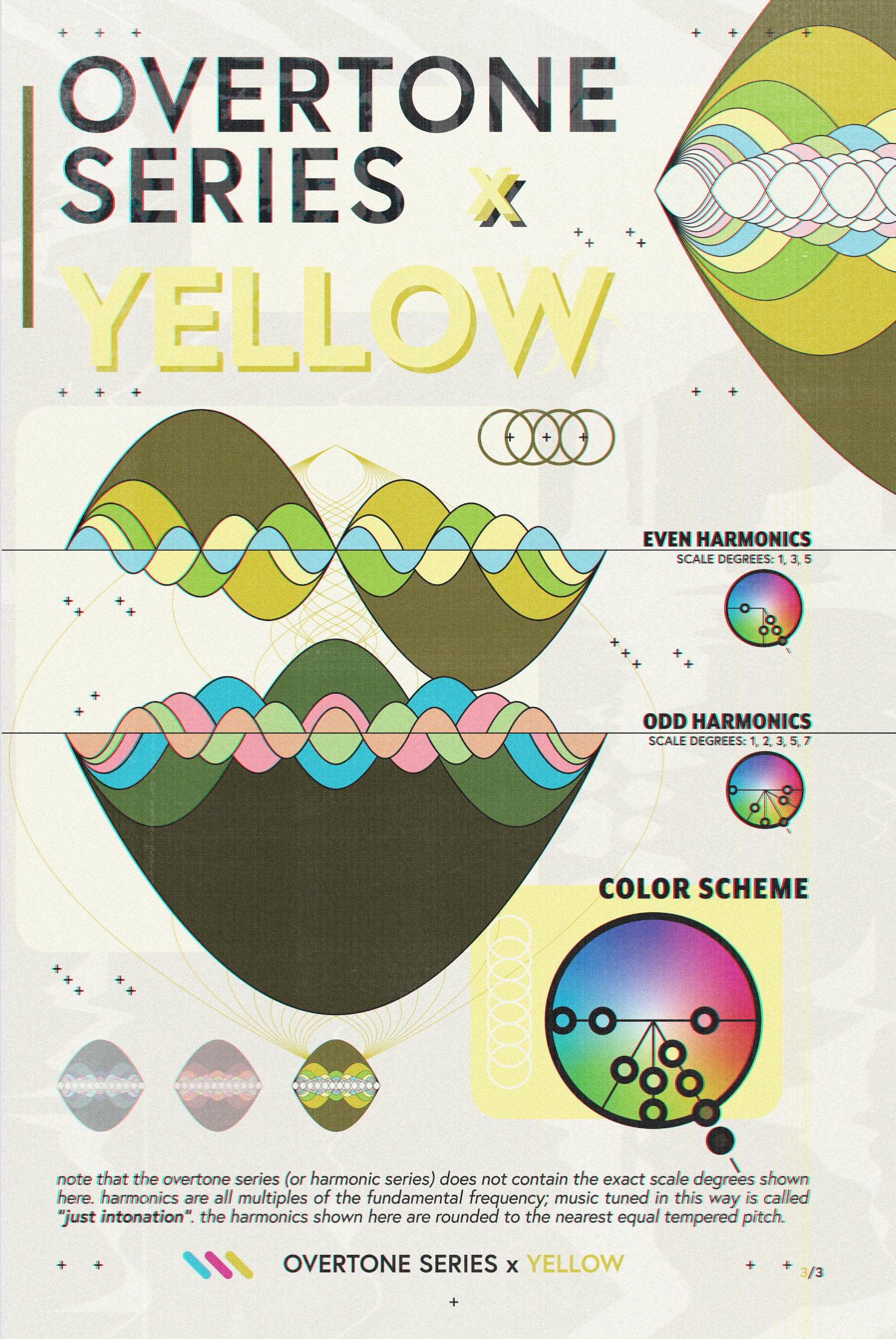
Color Harmony x Harmonic Analysis is a collection of posters that explore the concept of harmony in color and sound. It proposes a theoretical translation between the harmony of colors and the harmony described in western music theory based on teachings from mathematics, physics, and philosophy. The series explores a comparison between light and sound waves, western music theory visualized as color schemes, and harmonic analysis translated into color analysis. The collection is an attempt to capture moments of temporal art forms in a static medium that is visually exciting. The concepts in music theory and acoustics are not easily accessible, and often require disciplined study to grasp. This project attempts to show these concepts in an intuitive way.
Made using:
• Illustrator
• Photoshop
• Indesign
Stay Left!
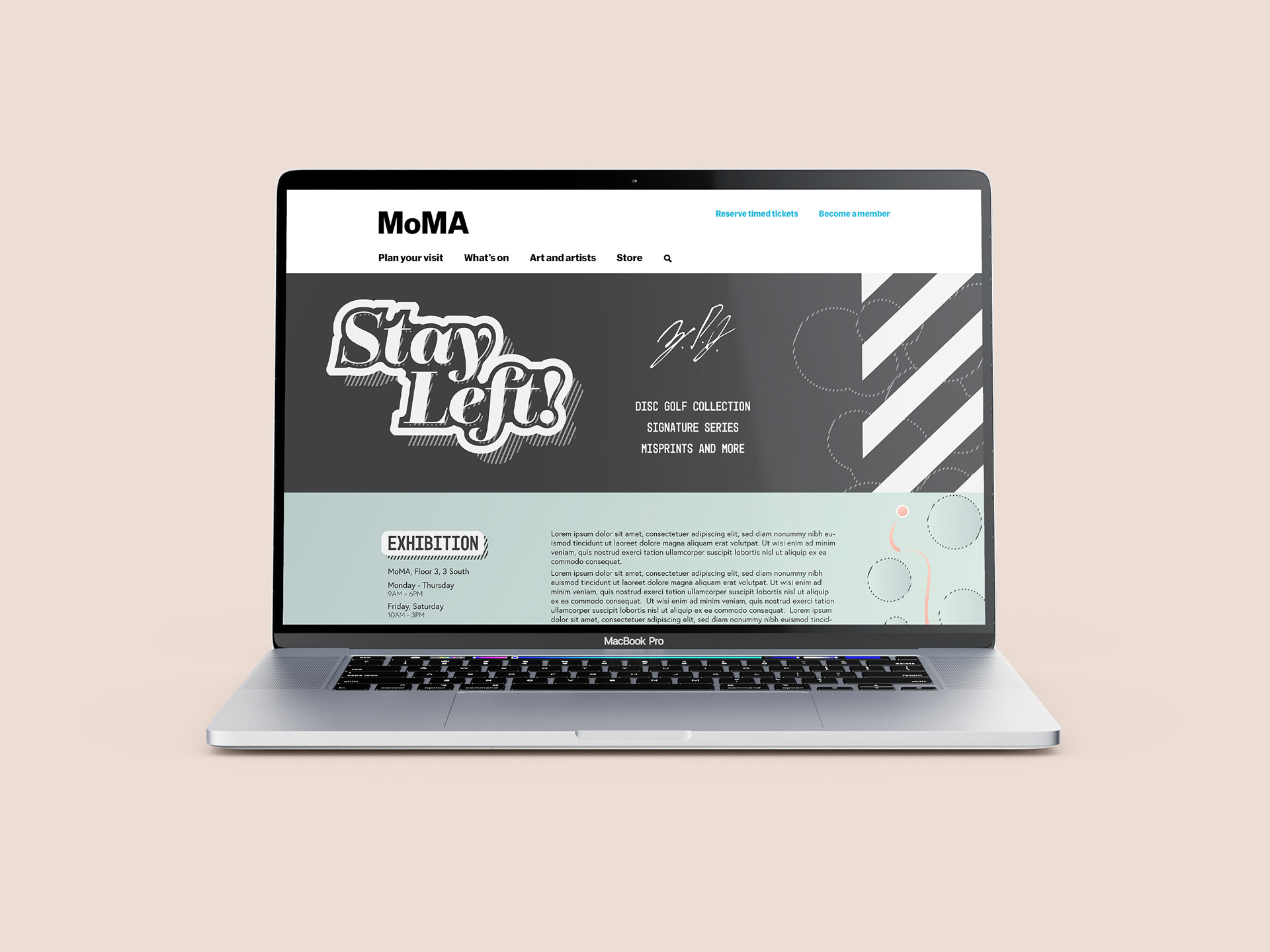
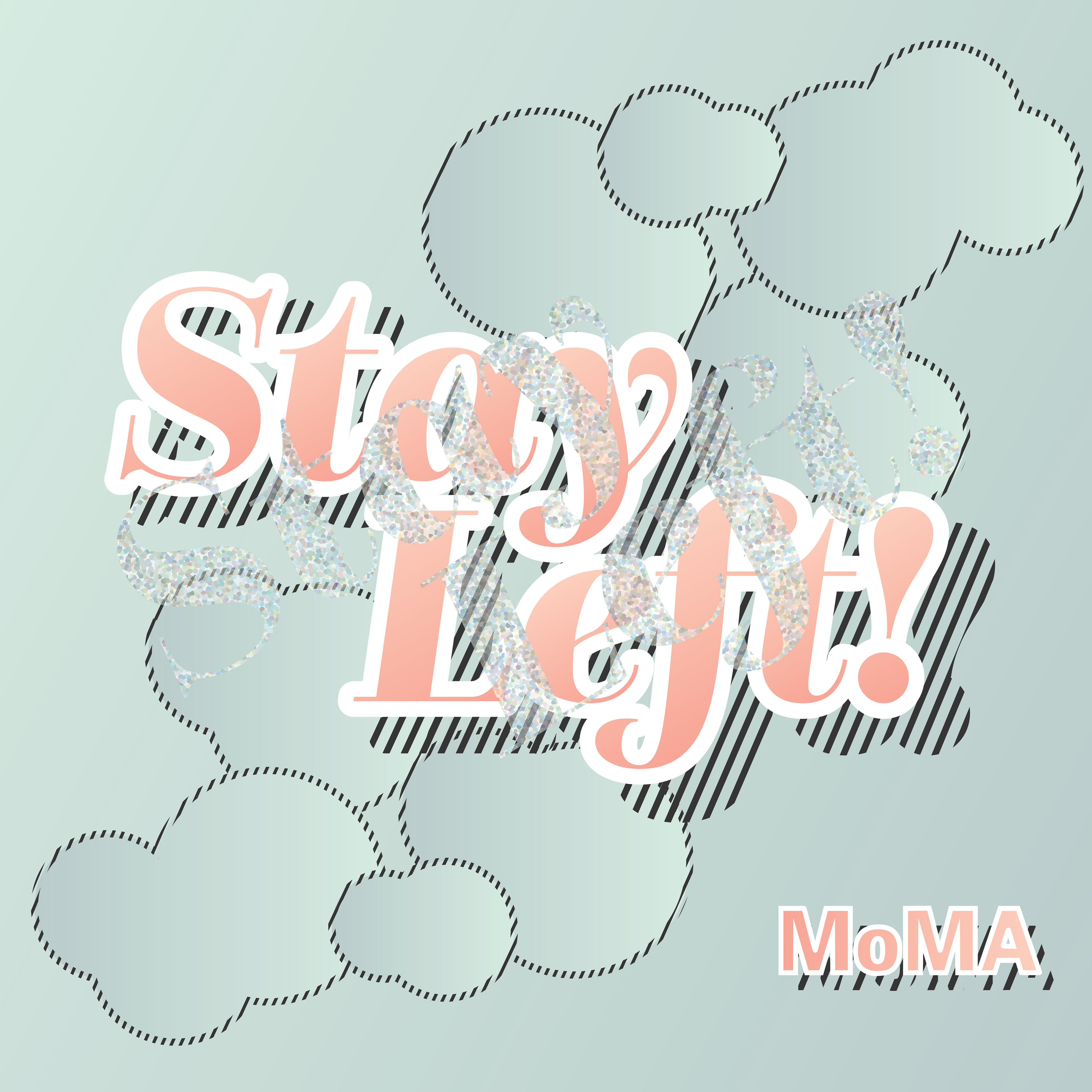
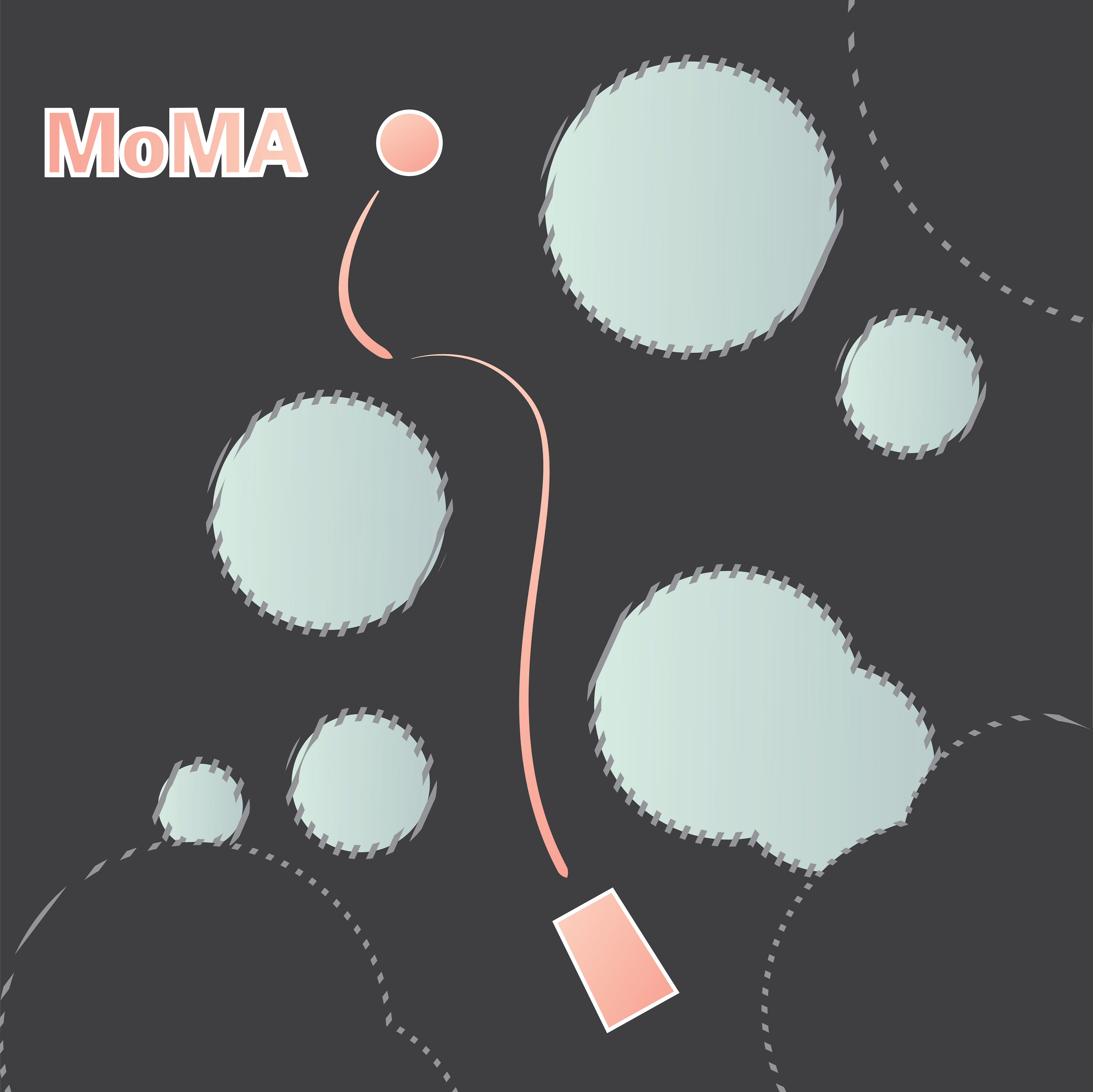
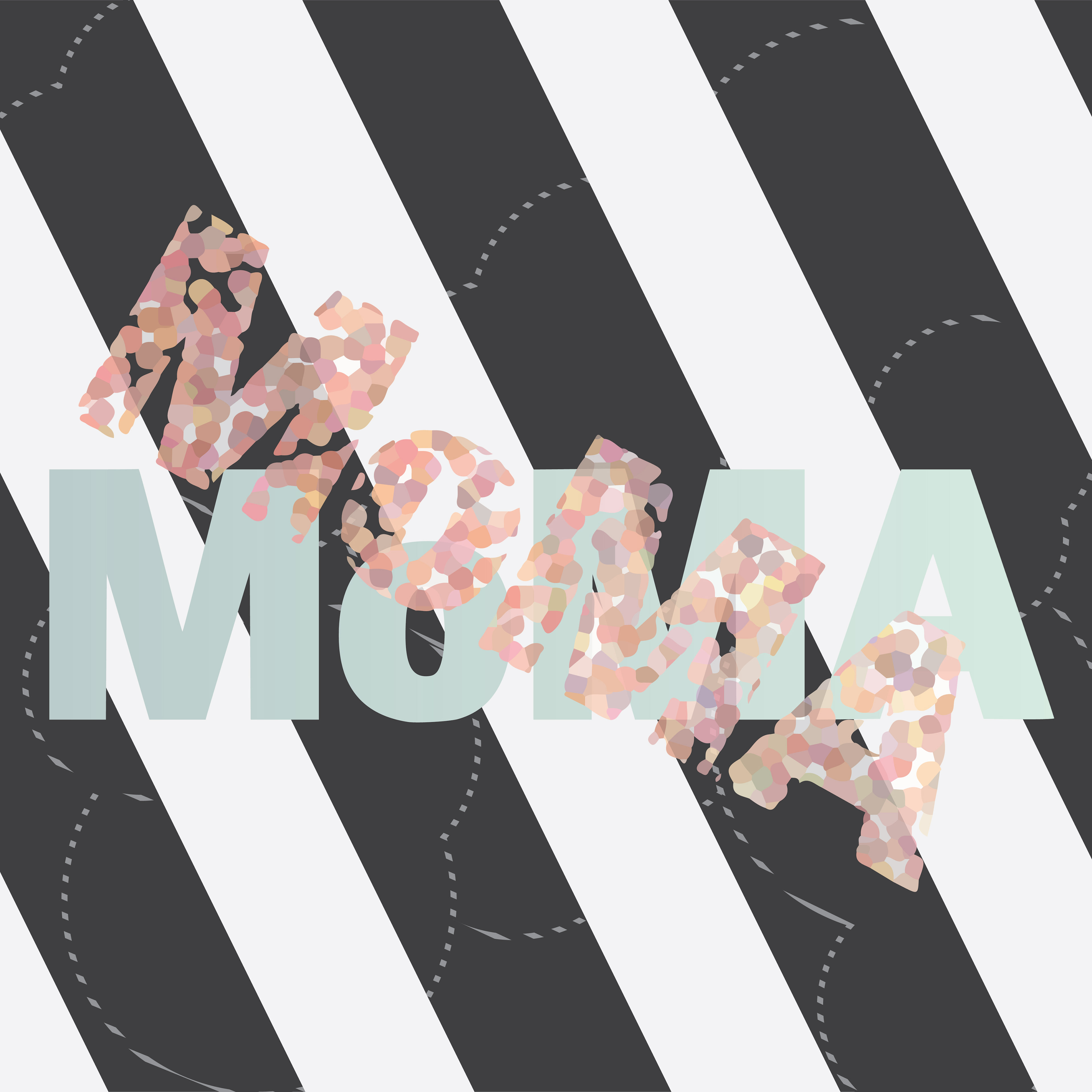
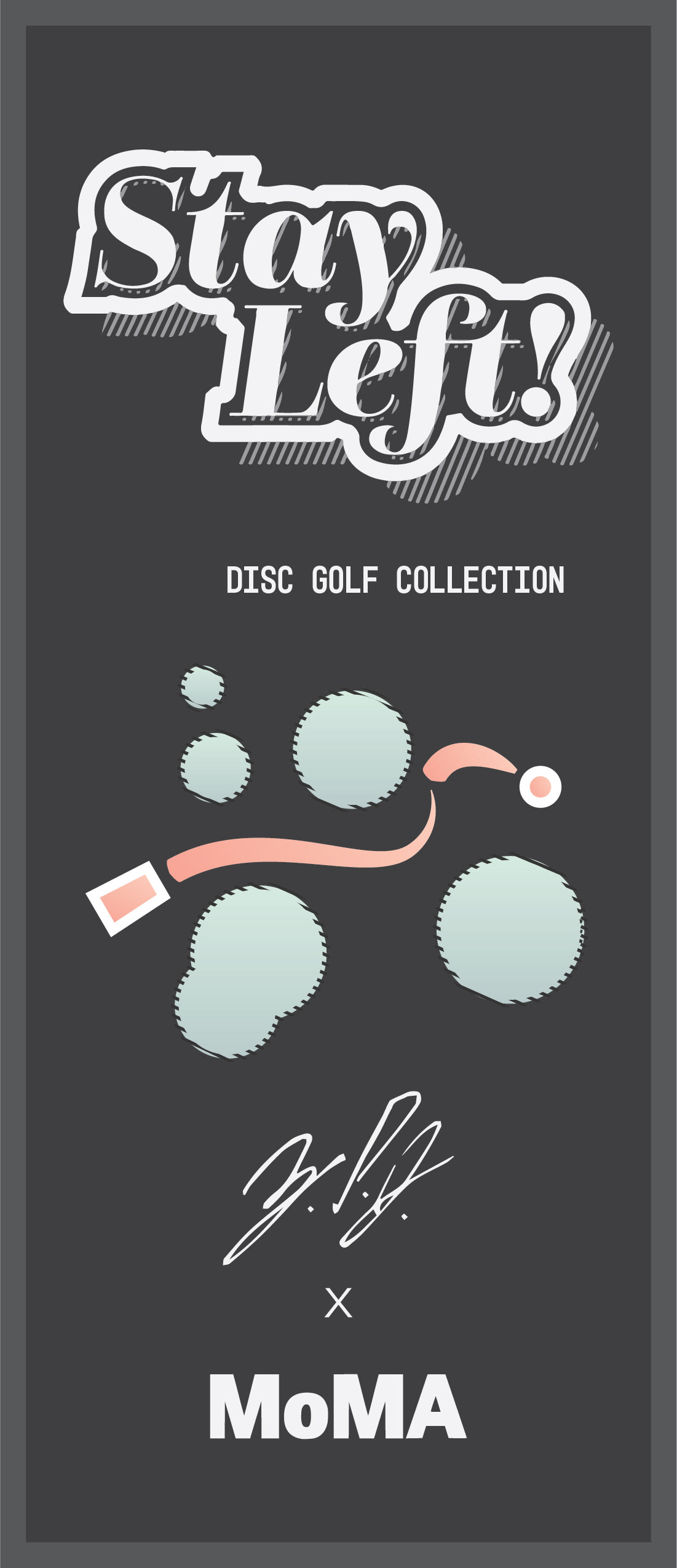
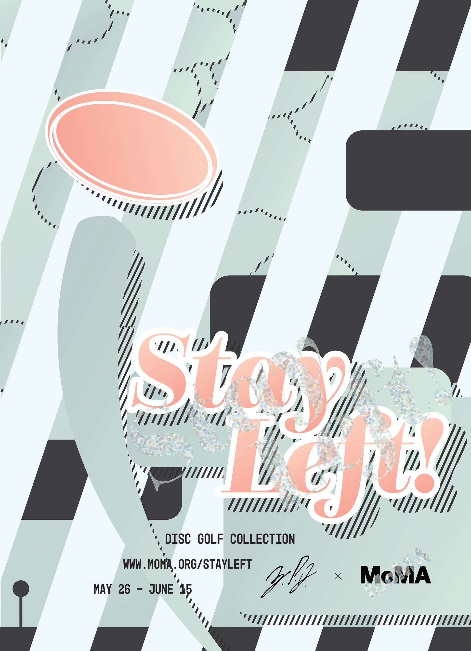
"Stay Left!" is a mock up of MoMA art exhibit branding based on disc golf. This school project includes design collateral for web, instagram, and print. My inspiration comes from the word marks on disc golf frisbees.
Made using:
• Illustrator
• Photoshop
Dallas Baggage Tag
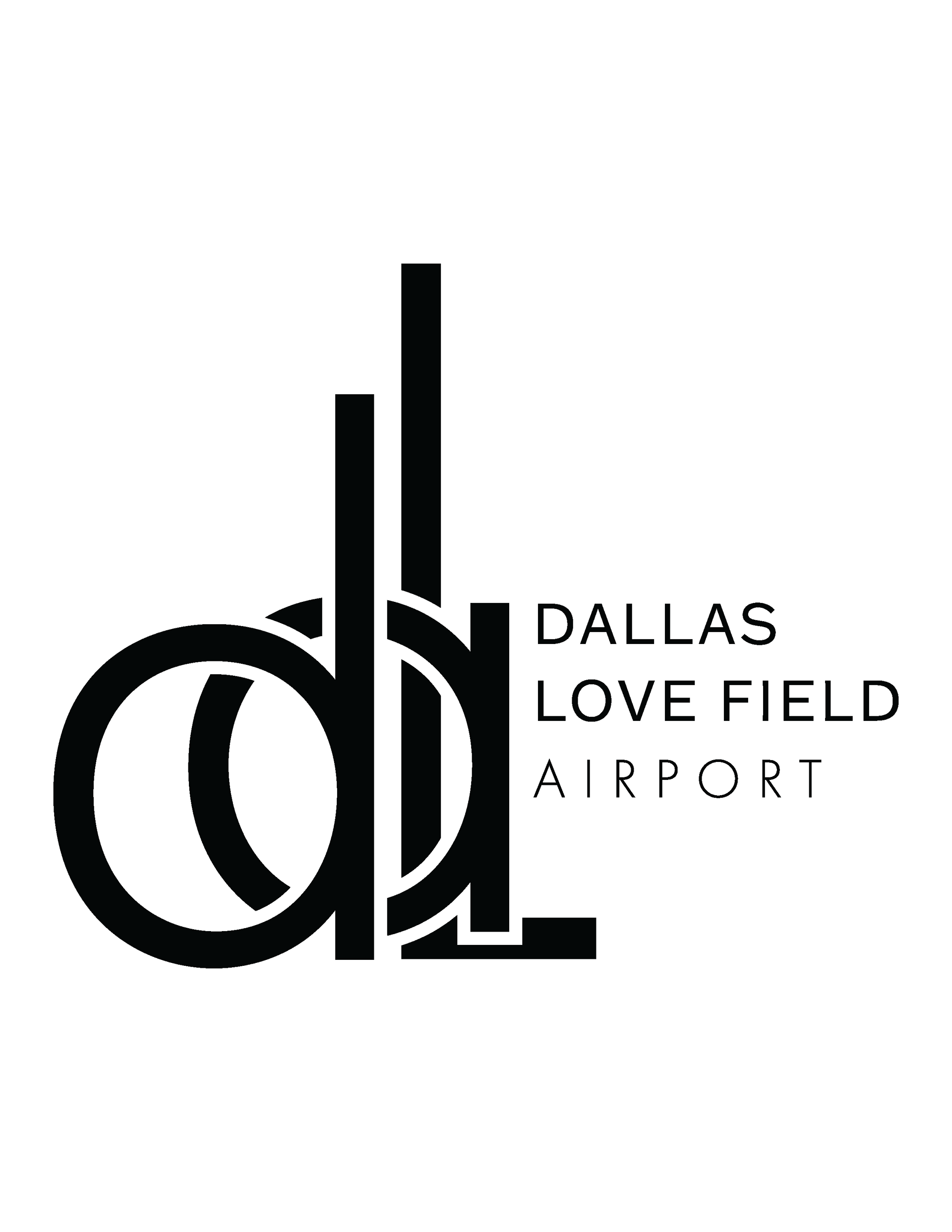
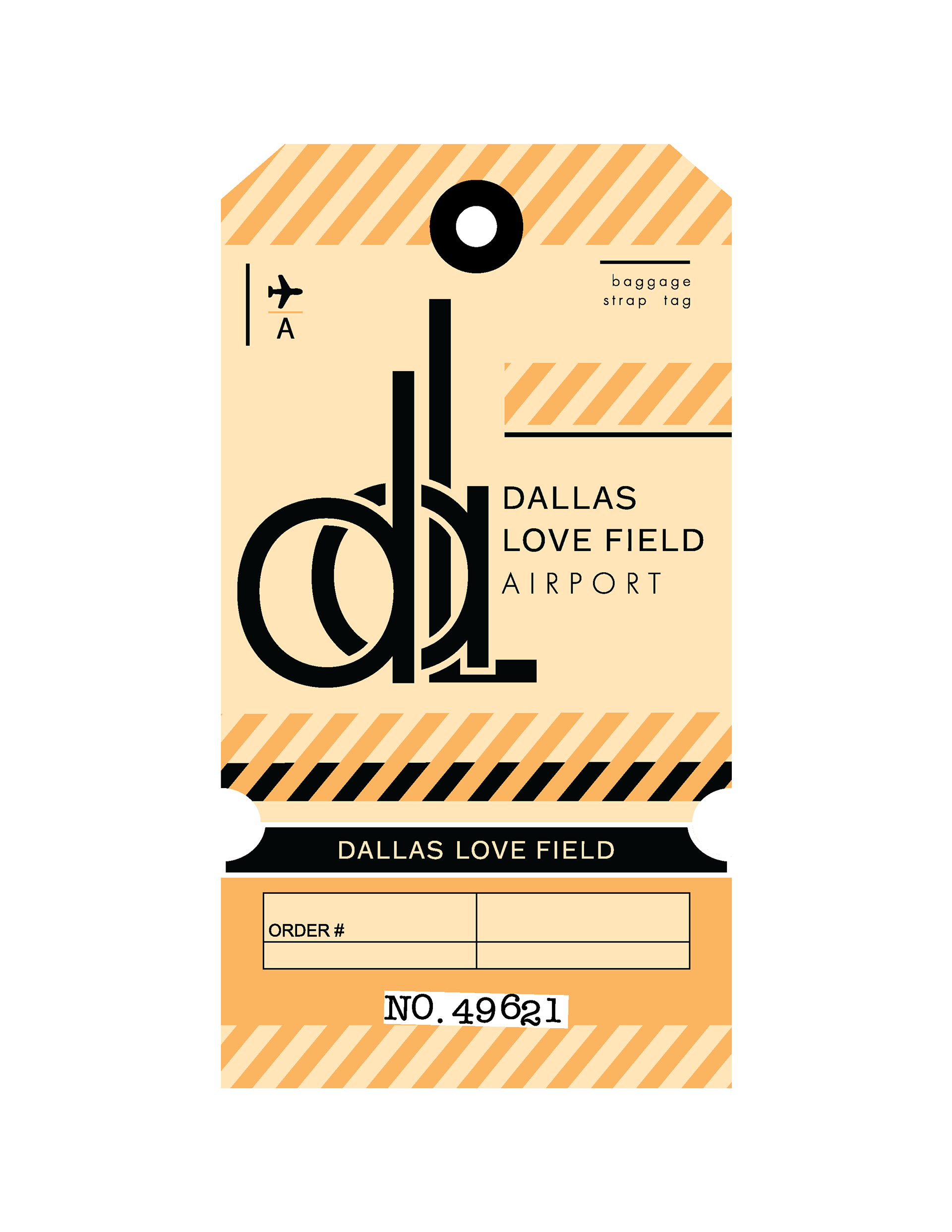

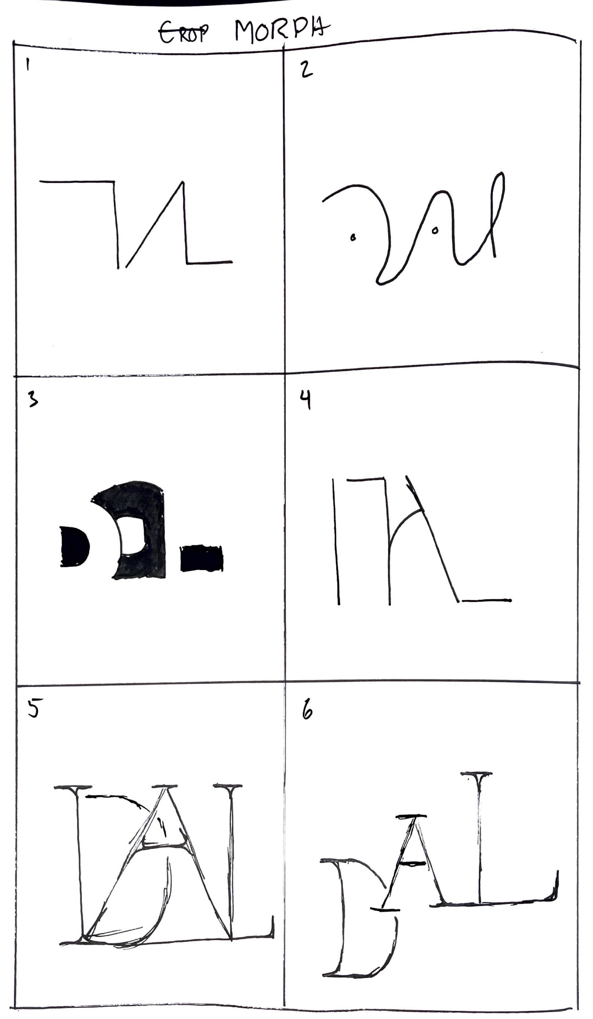
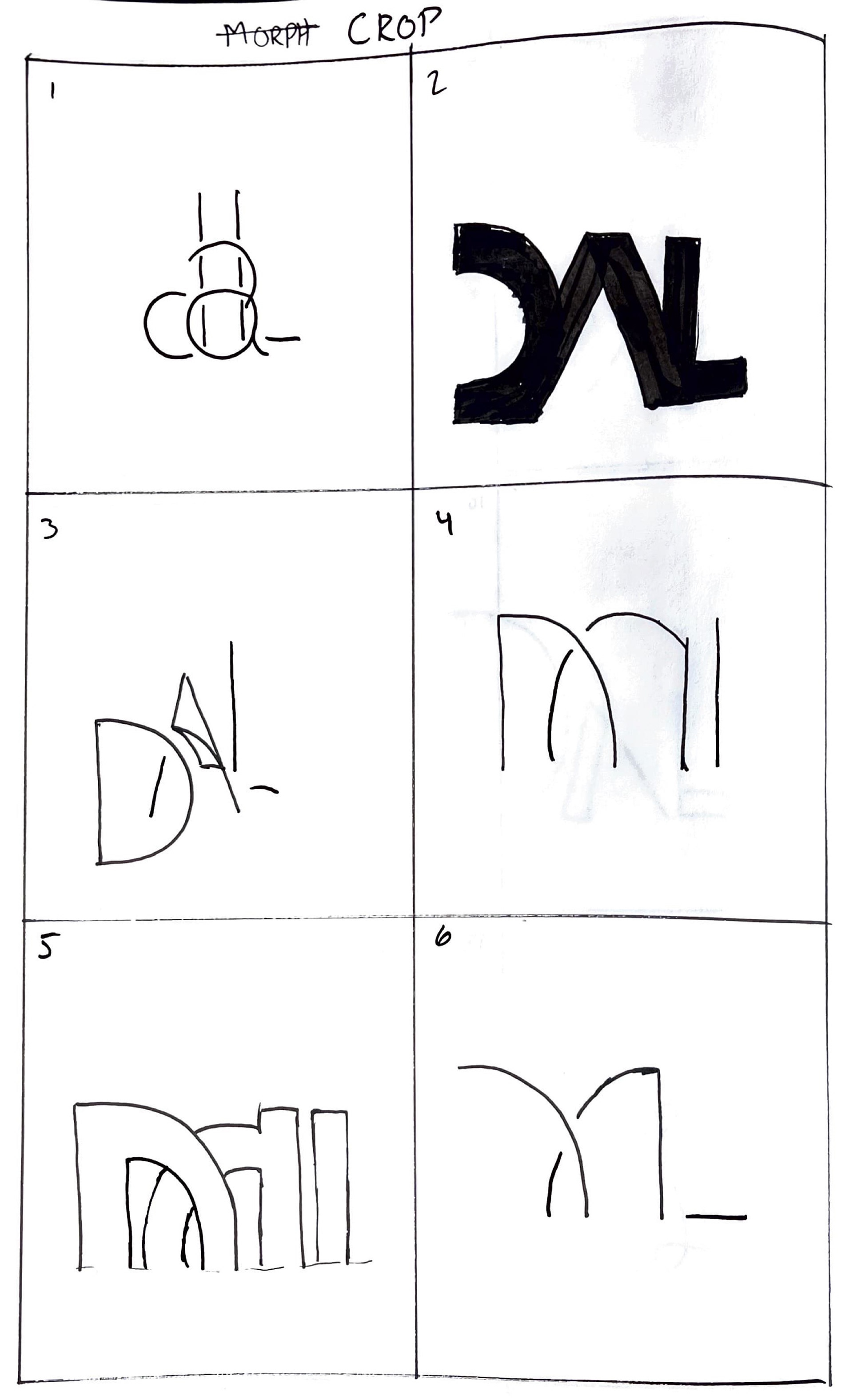
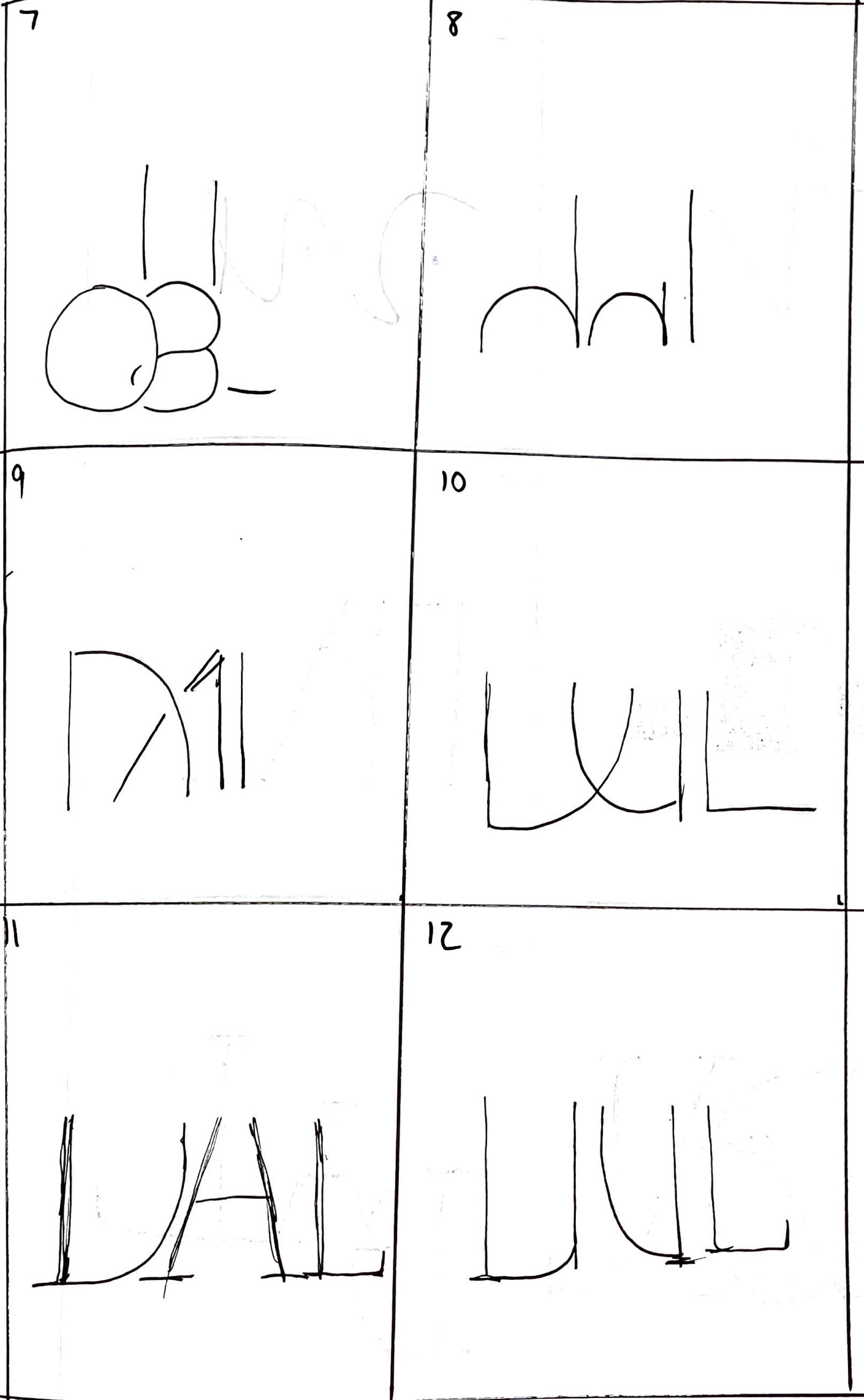
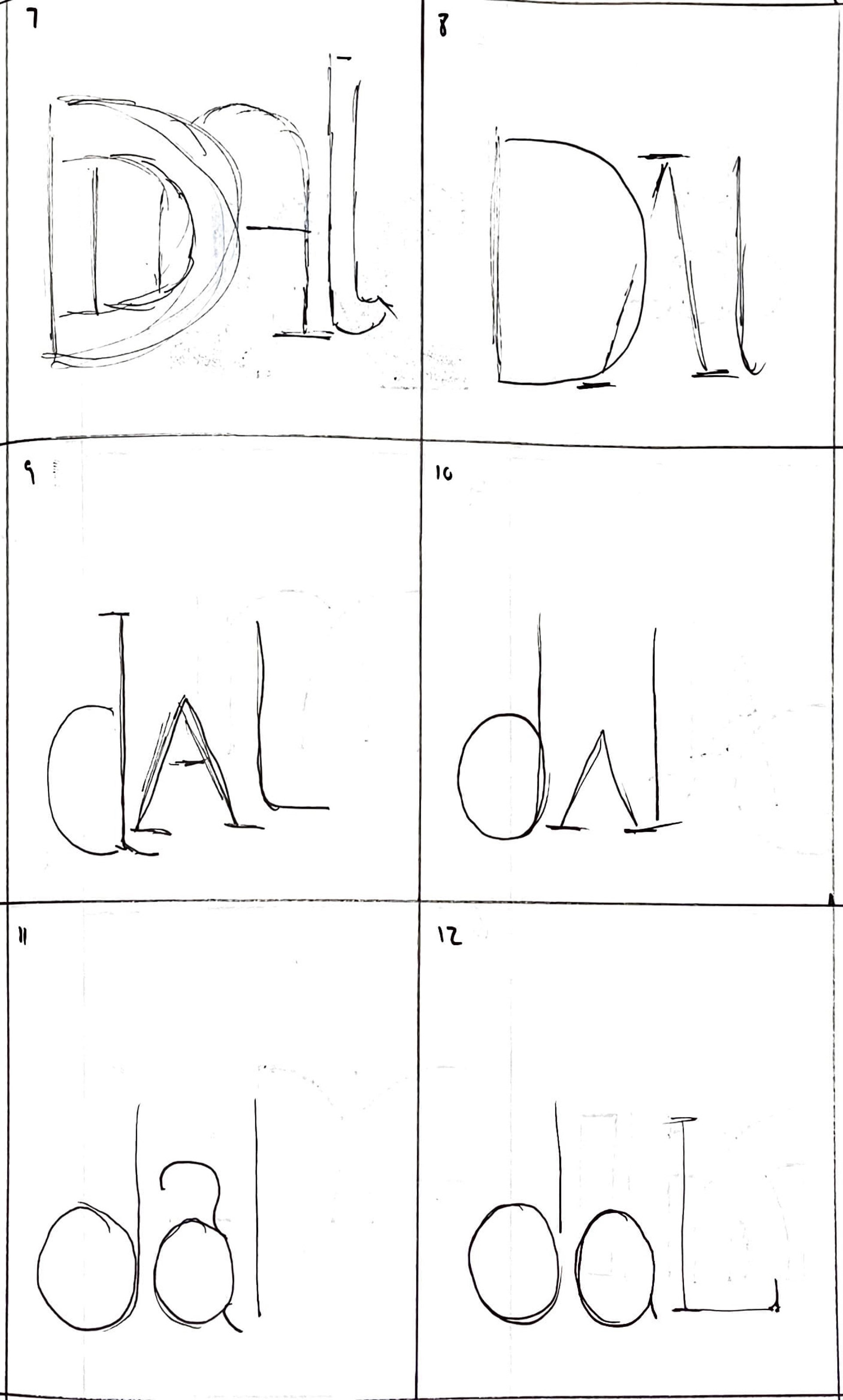
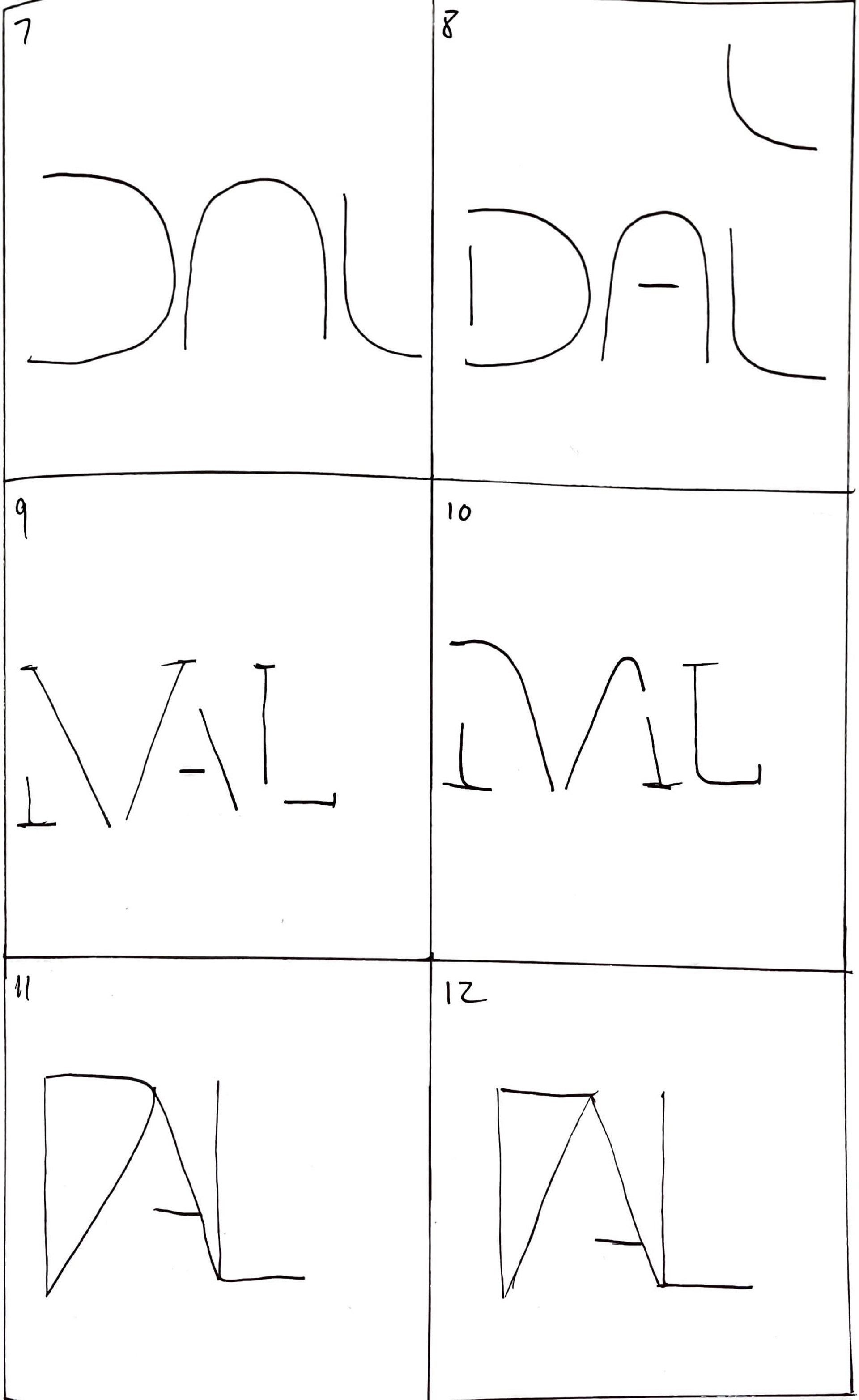
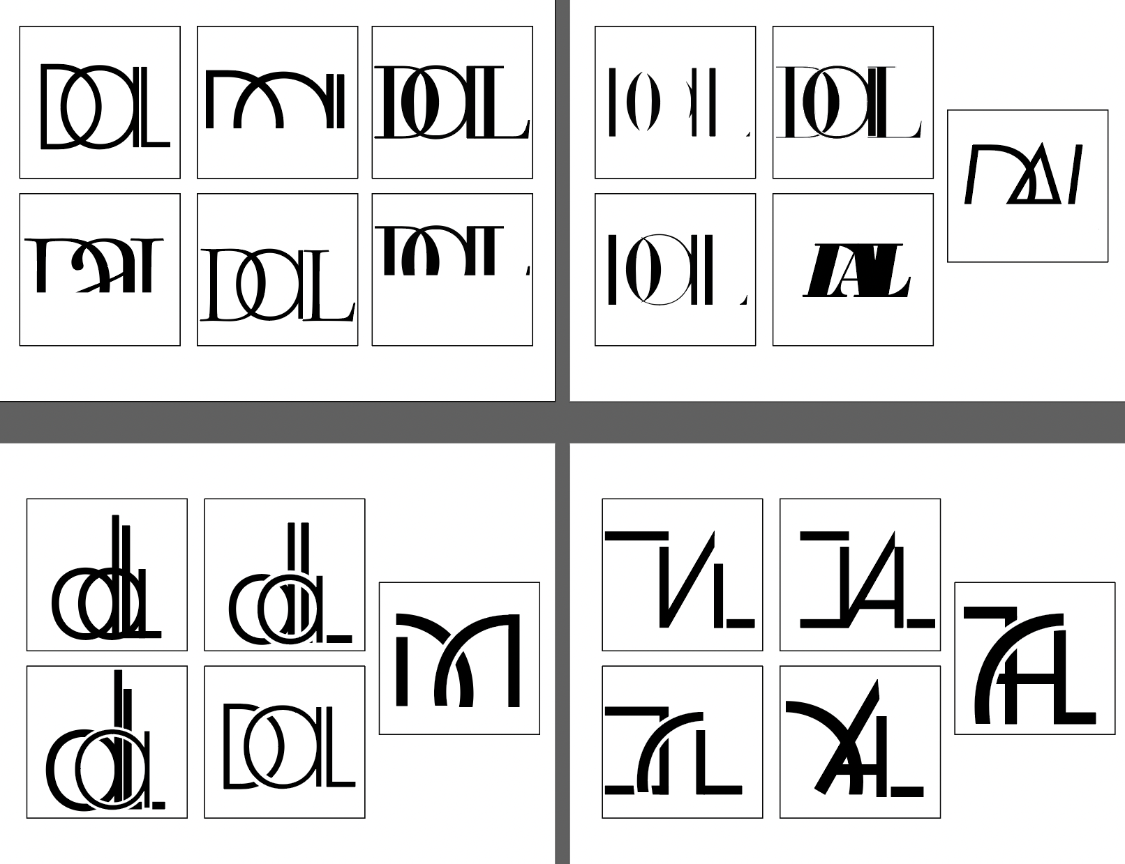
The Dallas Love Field Airport "letter mark" and hangtag are original designs influenced by the modern city scape of Dallas, Texas.
Process work is pictured.
Made using:
• Illustrator
• Pen and Paper
Providence Word Mark

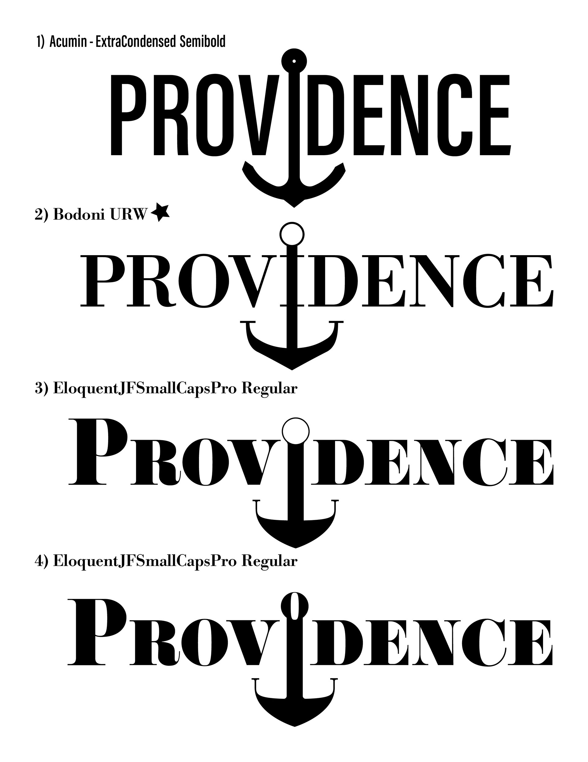

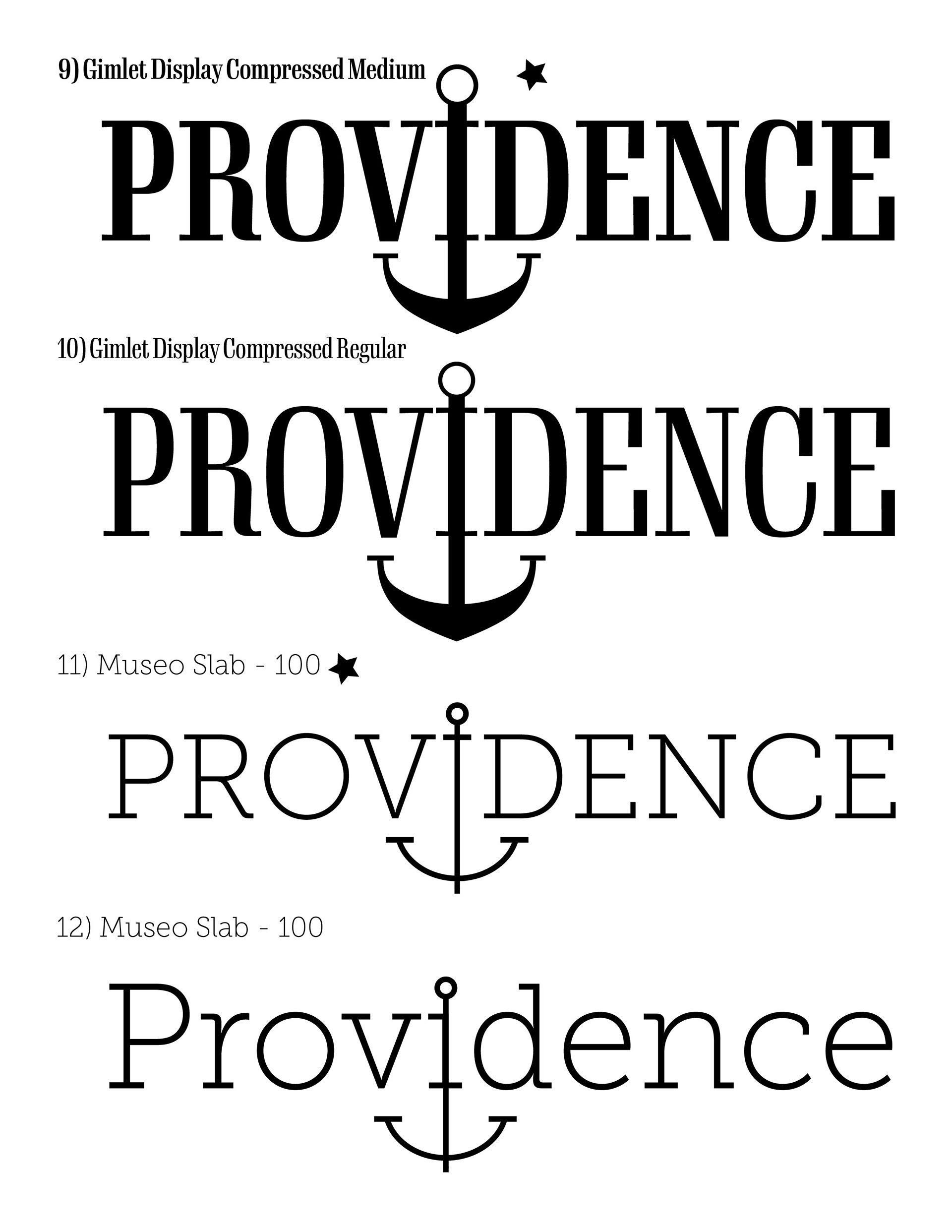
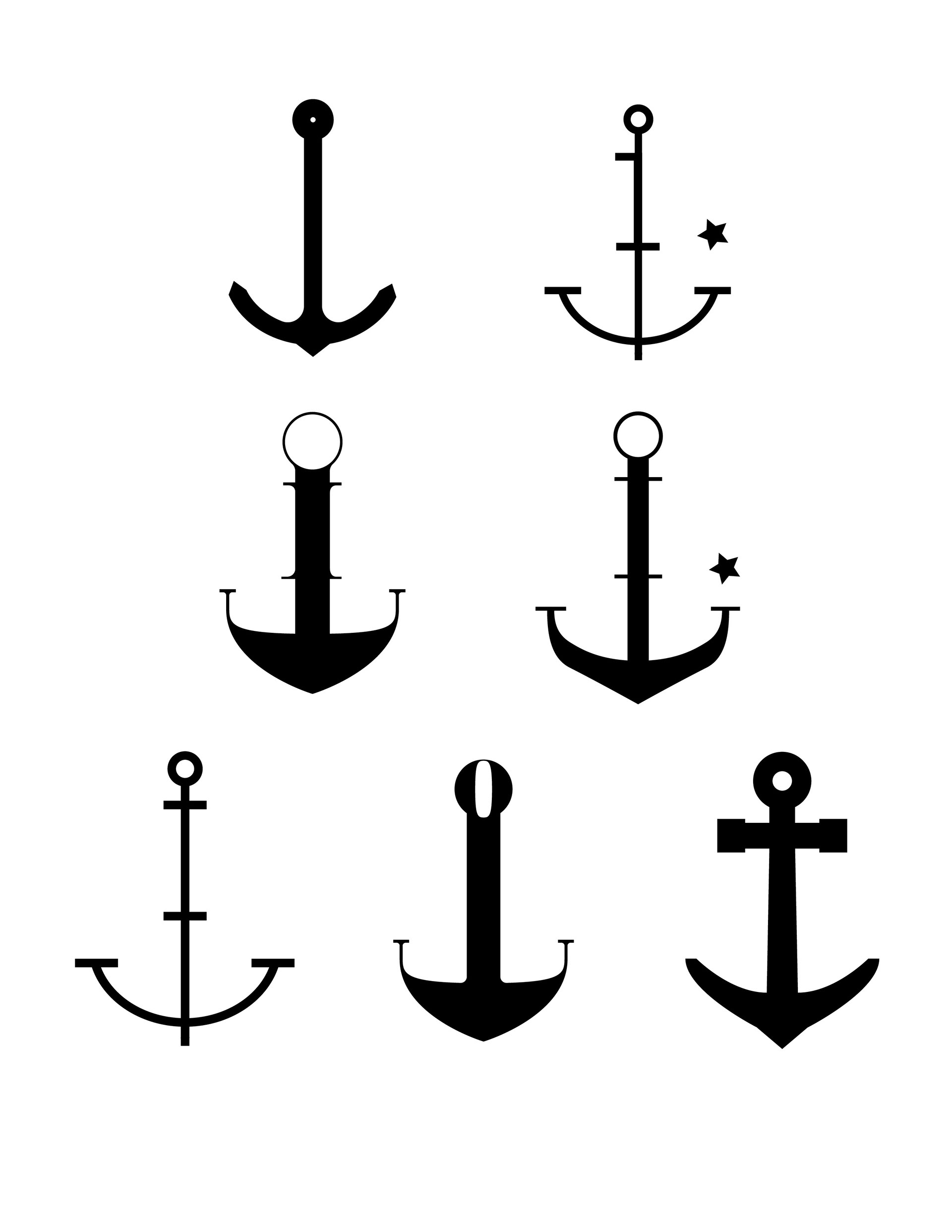
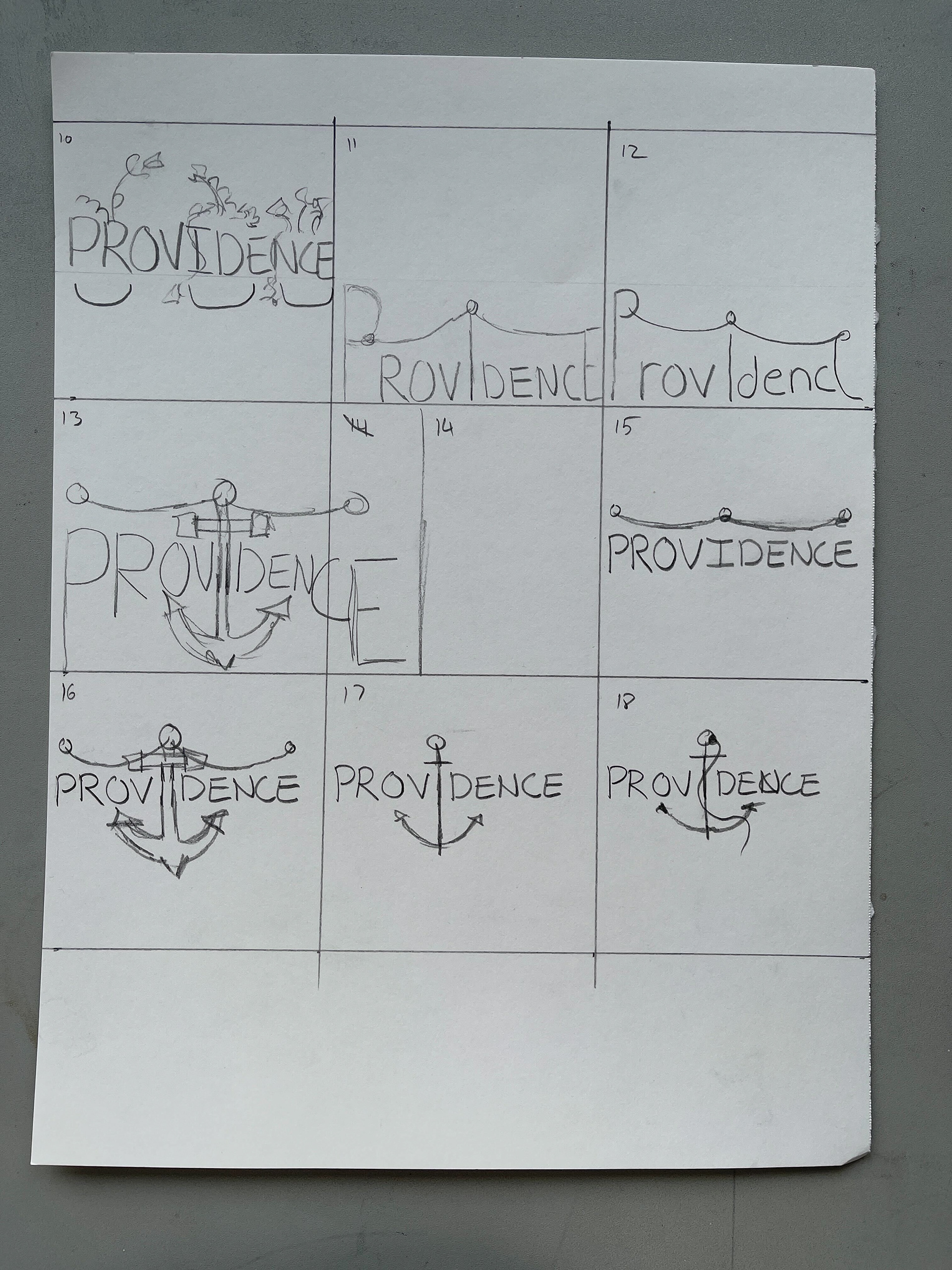
The Providence word mark is designed to represent the city in Rhode Island for its historic value.
Process work is pictured.
Made using:
• Illustrator
Just Right Cook Book
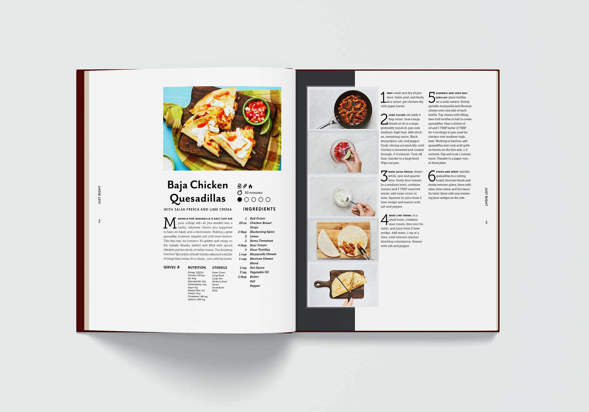
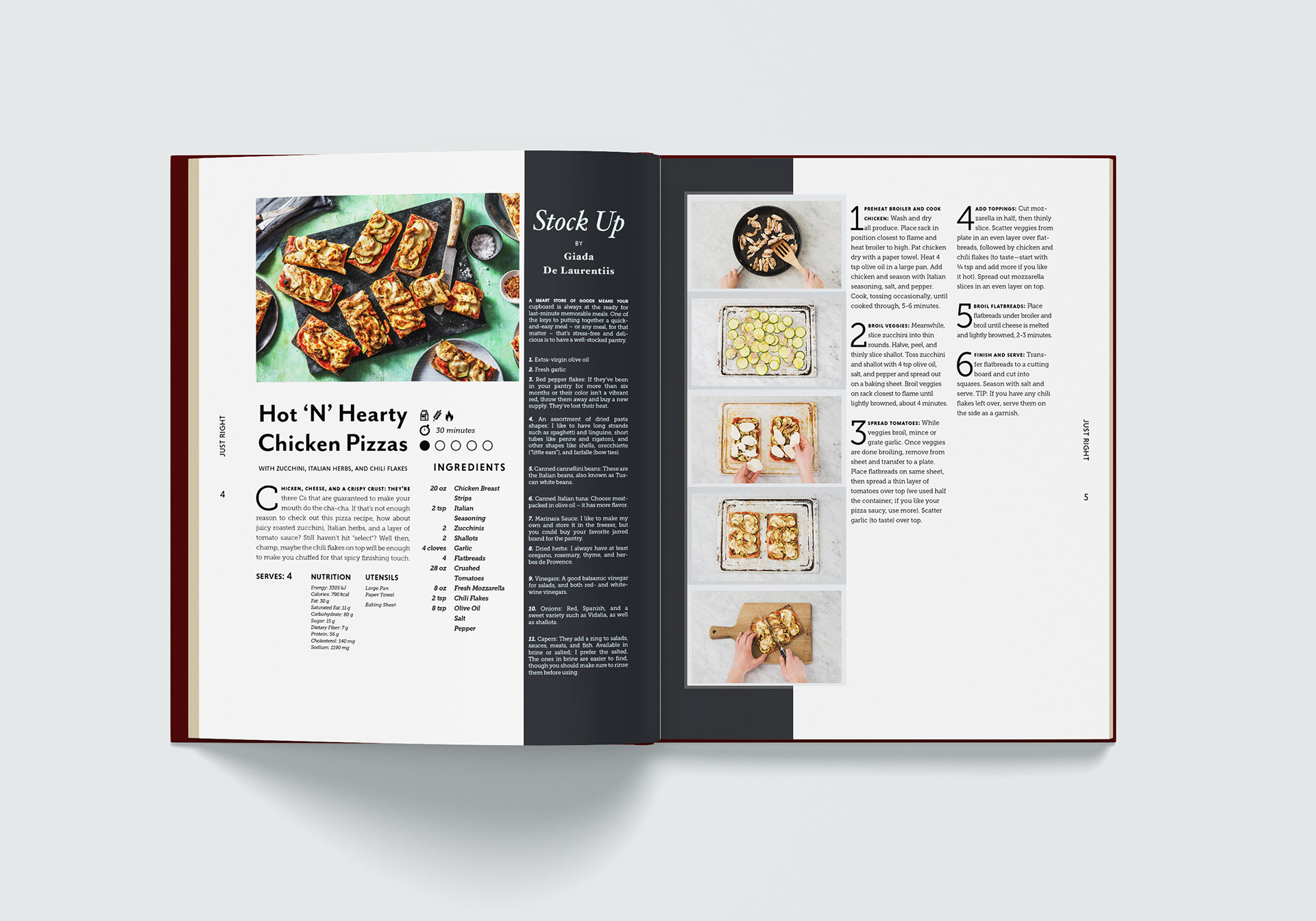
These two page spreads are mock ups of my original design for a cookbook. The goal of this project was to create a modular design that could be used throughout hundreds of pages for each unique recipe.
Made using:
• InDesign